11.5 Creating Charts
You can add a chart by running a built-in wizard or creating it manually in Page Designer.
- About Supported Charts
App Builder supports two types of charts: Charts (based on the Oracle JavaScript Extension Toolkit (Oracle JET) Data Visualizations) and AnyChart Charts. - Sample Charts
Developers can view chart examples by installing the Sample Charts sample application. - Adding a Chart by Running the Create Page Wizard
Add a chart to a new page by running the Create Page Wizard. - Adding a Chart on a New Page Using Remote Database References
Run the Create Page Wizard to add a new page with a chart using a remote database reference. - Adding a Chart in Page Designer
Add a chart by creating it manually in Page Designer. - Managing Charts
You can alter how a chart displays by editing chart attributes in Page Designer. - Using Custom JavaScript with Charts
Control the look and feel of a chart by adding custom JavaScript.
See Also:
Parent topic: Managing Database Application Components
11.5.1 About Supported Charts
App Builder supports two types of charts: Charts (based on the Oracle JavaScript Extension Toolkit (Oracle JET) Data Visualizations) and AnyChart Charts.
App Builder supports the following charts:
-
Chart - Chart support in Oracle Application Express is based on the Oracle JET Data Visualizations. Oracle JET empowers developers by providing a modular open source toolkit based on modern JavaScript, CSS3, and HTML5 design and development principles. The Oracle JET data visualization components include customizable charts, gauges, and other components that you can use to present flat or hierarchical data in a graphical display for data analysis. Each Oracle JET visualization supports animation, accessibility, responsive layout, internationalization, test automation, and a range of inter activity features. The charts provide dozens of different ways to visualize a data set, including bar, line, area, range, combination, scatter, bubble, polar, radar, pie, donut, funnel, and stock charts..
See Also:
"Working with Data Visualizations" in JavaScript Extension Toolkit (JET) Developing Applications with Oracle JET.
-
AnyChart Chart - AnyChart chart support is based on a third party charting solution provided by AnyChart. This is a flexible Flash and JavaScript (HTML5) based solution that enables developers to create animated and compact interactive charts. AnyChart charts have been categorized as a legacy component and may be deprecated in the future release.
See Also:
"Managing Legacy Charts" and "Upgrading an Application to Include New Components"
Parent topic: Creating Charts
11.5.2 Sample Charts
Developers can view chart examples by installing the Sample Charts sample application.
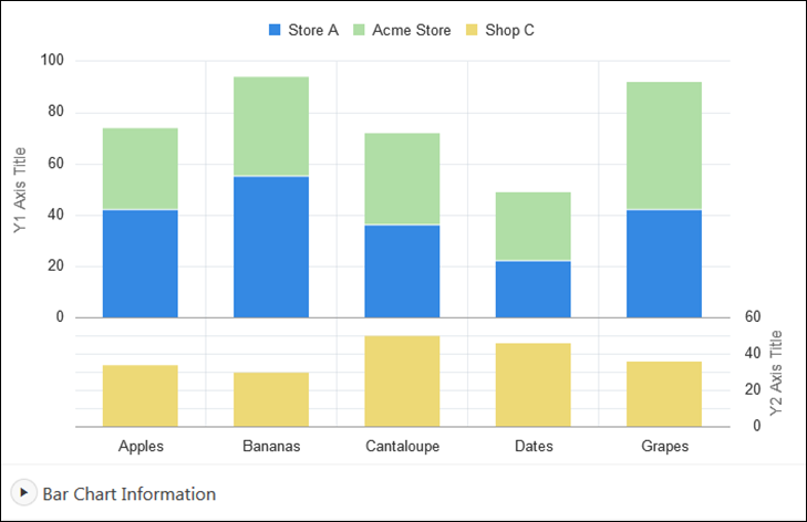
The following is a sample chart from Sample Charts sample application.

Description of the illustration GUID-D2F0935D-7EDB-47B6-90C1-F59E7961D3C1-default.png
The chart includes the following attributes:
-
Extra Y axis - Displays the title Y2 Axis Title, and associated with Shop C series of data.
-
Split Dual Y Axis - Displays two series of data, Store A and Acme Store, stacked and associated with the Y axis, and the third series of data, Shop C, associated with an extra Y axis and rendered as a separate chart below the other two series of data.
Expand the Bar Chart Information region at the bottom of the page to view information on the chart.
See Also:
"Installing a Productivity and Sample App" for more information on installing the Sample Charts application
Parent topic: Creating Charts
11.5.3 Adding a Chart by Running the Create Page Wizard
Add a chart to a new page by running the Create Page Wizard.
To add a chart on a new page:
Parent topic: Creating Charts
11.5.4 Adding a Chart on a New Page Using Remote Database References
Run the Create Page Wizard to add a new page with a chart using a remote database reference.
To add a chart on a new page:
Parent topic: Creating Charts
11.5.5 Adding a Chart in Page Designer
Add a chart by creating it manually in Page Designer.
To add a chart to an existing page in Page Designer:
Parent topic: Creating Charts
11.5.6 Managing Charts
You can alter how a chart displays by editing chart attributes in Page Designer.
See Also:
Parent topic: Creating Charts
11.5.6.2 Switching Chart Type
Once you create a chart, you can switch its chart type by editing chart attributes.
To switch a chart type:
Parent topic: Managing Charts
11.5.6.3 Enabling Automatic Refresh
Charts can monitor information by enabling the Automatic Refresh attribute on the Chart attributes page, or using a dynamic action with the Refresh action.
Parent topic: Managing Charts
11.5.6.3.1 Enabling the Automatic Refresh Attribute
Enabling the Automatic Refresh attribute updates the chart to reflect changes in the underlying data within a specified time interval.
To enable automatic refresh updates:
Parent topic: Enabling Automatic Refresh
11.5.6.3.2 Creating a Refresh Dynamic Action
To create a Refresh dynamic action:
Parent topic: Enabling Automatic Refresh
11.5.7 Using Custom JavaScript with Charts
Control the look and feel of a chart by adding custom JavaScript.
To use custom JavaScript:
Tip:
The Sample Charts application contains a number of examples of using custom JavaScript with chart. See "Installing a Productivity and Sample App" for more information on installing sample applications.
See Also:
Parent topic: Creating Charts