9.5.2 Managing Interactive Grid Attributes
Report Attributes control how an interactive grid works. Developers edit interactive grid Attributes to control if end users can edit the underlying data, configure report pagination, create error messages, configure the toolbar and download options, control if users can save public reports, and add Icon and Detail Views.
- Editing Interactive Grid Attributes
- Making an Existing Interactive Grid Editable
- Controlling Interactive Grid Pagination
- Customizing the Interactive Grid Toolbar
- Enabling Users to Save Public Reports in Interactive Grids
- Restricting Who Can Save Public Reports
- Enabling Icon View in an Interactive Grid
- Enabling Detail View in an Interactive Grid
See Also:
Parent topic: Managing Interactive Grids
9.5.2.1 Editing Interactive Grid Attributes
To edit interactive grid Attributes:
See Also:
Parent topic: Managing Interactive Grid Attributes
9.5.2.2 Making an Existing Interactive Grid Editable
End users can alter the report layout using Column menus and sort options, rearrange columns by dragging and dropping, and change how data displays using options on the Actions menu. However, developers determine whether the underlying data is read-only or editable by users. When an interactive grid is editable, end users can edit the underlying data, add rows, delete rows, and refresh rows. By default, editable interactive grids include a Save button on the toolbar. Developers can determine
To make an interactive grid editable:
See Also:
Parent topic: Managing Interactive Grid Attributes
9.5.2.3 Controlling Interactive Grid Pagination
Pagination provides the end user with information about the number of rows displayed and the current position within the result set.
To change interactive grid pagination:
Tip:
Install the sample application, Sample Interactive Grids, to see interactive grid pagination examples. See "Installing a Productivity and Sample App."
Parent topic: Managing Interactive Grid Attributes
9.5.2.4 Customizing the Interactive Grid Toolbar
All interactive grids include a toolbar at the top of the page. Developers can customize what controls display on the toolbar or remove it.
Note:
Some of the options described in this procedure only apply if the interactive grid is editable. See "Making an Existing Interactive Grid Editable".
To customize the interactive grid toolbar:
Tip:
To view an example of adding a toolbar button, install the sample application, Sample Interactive Grids, and go to Reporting, Add Toolbar Button. See "Installing a Productivity and Sample App."
Parent topic: Managing Interactive Grid Attributes
9.5.2.5 Enabling Users to Save Public Reports in Interactive Grids
Users can save an interactive grid as a Public report if the report developer enables that capability. Public reports display on the Saved Reports list on the toolbar and are available to all users. However, only the user who creates a Public report can save, rename, or delete it.
Tip:
The Save Public Report attribute is only available to authenticated users and can be further restricted by the defined Authorization scheme. See "Restricting Who Can Save Public Reports."
To enable end users to save Public reports:
Parent topic: Managing Interactive Grid Attributes
9.5.2.6 Restricting Who Can Save Public Reports
Developers can select an authorization scheme to restrict who can save Public reports. To enable an end user to save a Public report, this authorization scheme must evaluate to TRUE for that user. If an authorization scheme is not selected, then any user may save Public reports.
To restrict who can save a Public report:
Parent topic: Managing Interactive Grid Attributes
9.5.2.7 Enabling Icon View in an Interactive Grid
Interactive grids support different views of data. By default, interactive grids display data in a Grid view. Developers can optionally display data as icons. Enabling Icon view adds an Icon button to the select view button group.
- About Icon View in an Interactive Grid
- Adding Icon View to an Interactive Grid
- Adding a Custom Icon View Link to an Interactive Grid
Parent topic: Managing Interactive Grid Attributes
9.5.2.7.1 About Icon View in an Interactive Grid
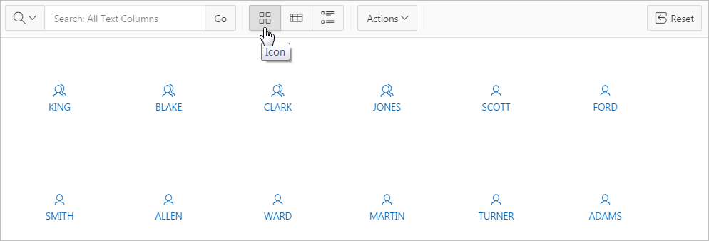
Interactive grids support different views of data. Users can switch between these views by clicking the buttons in the select view button group. The following illustration shows an interactive grid with Icon view enabled and the Icon button selected. To enable Icon view, you must identify the columns used to identify the icon, the label, and the target (that is, the link).

Description of the illustration GUID-060A0CB3-C95D-49E7-9DBB-20C2E93BCCA0-default.png
Viewing a Working Example of Icon View
To see a working example of this Icon view, install the sample application, Sample Interactive Grids and review Reporting, Icon and Detail Views .
See Also:
Parent topic: Enabling Icon View in an Interactive Grid
9.5.2.7.2 Adding Icon View to an Interactive Grid
An important requirement of icon view is that each item in the view must have the same width and height and the item content must not overflow. The width and height are set with CSS rules on elements with a class of a-IconList-item.
To add an Icon view to an interactive grid:
To add an Icon view to an interactive grid:
Parent topic: Enabling Icon View in an Interactive Grid
9.5.2.7.3 Adding a Custom Icon View Link to an Interactive Grid
A custom Icon View link provides greater flexibility in defining the content of the Icon View, including the ability to utilize more than one column.
To add custom Icon View link to an interactive grid:
Parent topic: Enabling Icon View in an Interactive Grid
9.5.2.8 Enabling Detail View in an Interactive Grid
Interactive grids support different views of data. By default, interactive grids display data in a Grid view. Developers can optionally display data as in a Detail view. Enabling Detail view adds an Detail button to the select view button group.
Parent topic: Managing Interactive Grid Attributes
9.5.2.8.1 About Detail View in an Interactive Grid
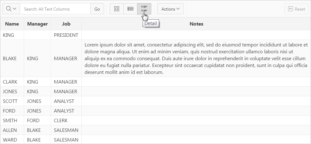
Interactive grids support different views of data. Users can switch between these views by clicking the buttons in the select view button group. The following illustration shows an interactive grid with Detail view enabled and the Detail button selected. Detail view displays column values using developer defined HTML markup as shown in the following illustration.

Description of the illustration GUID-469D06D1-120C-4071-B91F-78EFE8F3EC7C-default.png
Viewing a Working Example of Icon View
To see a working example of this Icon view, install the sample application, Sample Interactive Grids and review Reporting, Icon and Detail Views .
See Also:
Parent topic: Enabling Detail View in an Interactive Grid
9.5.2.8.2 Adding a Detail View to an Interactive Grid
To add a Detail view to an interactive grid:
Parent topic: Enabling Detail View in an Interactive Grid