14.1 Managing Page-Level Items
An item is part of an HTML form. Examples of page-level item include a check box, a date picker, plain text, a file browse field, a popup list of values, a select list, a text area, and so on.
This section describes what a page-level item is, how to view existing page-level items, how to create new page-level items, and how to edit an item in Page Designer to change its appearance or behavior.
- Understanding Page-Level Items
An item is part of an HTML form such as a check box, date picker, display as text, file browse field, popup list of values, select list, or a text area. - Viewing Page-Level Items
Learn how to view page-level attributes in Page Designer. - Creating Page-Level Items
You create page-level items in Page Designer in either the Rendering tab or by adding an item from the Gallery. - Editing Page-Level Items
Developers edit Item attributes in Page Designer to control how items display on a page.
Parent topic: Managing Database Application Controls
14.1.1 Viewing Page-Level Items
Learn how to view page-level attributes in Page Designer.
To view page-level attributes in Page Designer:
Parent topic: Managing Page-Level Items
14.1.2 Creating Page-Level Items
You create page-level items in Page Designer in either the Rendering tab or by adding an item from the Gallery.
- Creating a Page-Level Item from the Rendering Tab
- Adding a Page-Level Item from the Gallery
- Creating a Static List of Values
- Creating a Cascading List of Values
- Creating a Shuttle Item on the Form Page in Page Designer
Parent topic: Managing Page-Level Items
14.1.2.1 Creating a Page-Level Item from the Rendering Tab
To create a page-level item from the Rendering tab:
See Also:
Parent topic: Creating Page-Level Items
14.1.2.2 Adding a Page-Level Item from the Gallery
To create a page-level item by adding if from the Gallery:
See Also:
Parent topic: Creating Page-Level Items
14.1.2.3 Creating a Static List of Values
To create a static list of values:
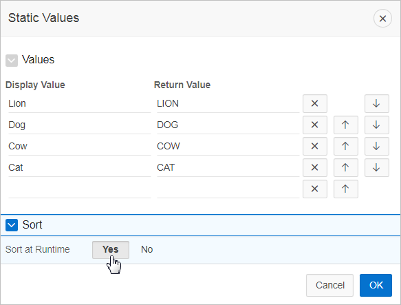
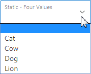
Example 14-1 Example 1: Four Values Displayed in Alphabetical Order
This example shows the Static Values dialog with four values defined: Lion, Dog, Cow, and Cat. The return value of each entry is capitalized. Sort at Runtime is set to Yes so that the list displays alphabetical order.
Description of the illustration GUID-A9F3AA40-D13B-4E5F-9C4D-15AF5A35498C-default.png
In a running application this select list would look similar to the following illustration.
Description of the illustration GUID-9F5C8ED2-DA05-4100-BDE2-5B2A507B2FB9-default.png
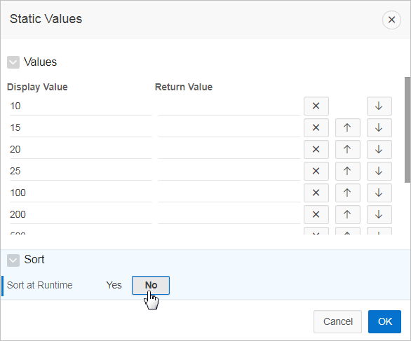
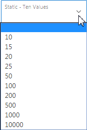
Example 14-2 Example 2: Ten Values Displayed in the Order Listed
This example shows the Static Values dialog with ten values defined: 10, 15, 20, 25, 50, 100, 200, 500, 1000, and 10000 which display in the order listed. The return value of each entry equals the display value.
Description of the illustration GUID-FEF04847-90F3-485B-8AA9-5E52E12FA91D-default.png
In a running application this select list would look similar to the following illustration.
Description of the illustration GUID-7A9E1AA6-7B44-4106-8C0D-496D42A4AE7D-default.png
Example 14-3 Example 3: A List of Values with Having Both a Return and Display Value
This example shows the Static Values dialog with two values defined. The first value has a Display Value of Yes and a Return Value of Y. The second value has a Display Value of No and a Return Value of N Sort at Runtime is set to No to make sure Yes always displays first.
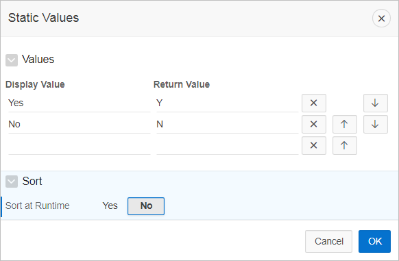
Description of the illustration GUID-B50C8DEF-3021-4D38-A463-0336F782135C-default.png
In a running application this select list would look similar to the following illustration.
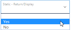
Description of the illustration GUID-342E3DC0-C1A7-4EE0-938A-418C26E00EB3-default.png
Parent topic: Creating Page-Level Items
14.1.2.4 Creating a Cascading List of Values
By creating a cascading list of values (LOV), one item on a page determines the list of values for another item. App Builder includes cascading LOV support for the following item types: Select List, Shuttle, Checkbox, Radio Group, Popup LOV, and List Manager.
You create a cascading LOV by creating two items. To populate the second item, you specify a Cascading LOV Parent Item when running the Create Item Wizard or by editing the item's attributes.
The following example demonstrates how to create two related select lists where the value of the first list populates the second.
To create a cascading list of values:
Parent topic: Creating Page-Level Items
14.1.2.5 Creating a Shuttle Item on the Form Page in Page Designer
To create a shuttle on the form page:
DEPT table that shows which employees are assigned to a given department. Second, you create a shuttle item that lists employees alphabetically to make it easier to assign employees to a department.To create a shuttle item on a form:
- View the form page in Page Designer.
- In Page Rendering, right-click region containing the form and select Create Page Item.
- In the Property Editor, edit the following attributes:
- In the Property Editor, edit the List of Values attributes:
- In the Property Editor, edit the Source attributes
- Click Save.
- Click Save and Run to view the page.
Parent topic: Creating Page-Level Items
14.1.3 Editing Page-Level Items
Developers edit Item attributes in Page Designer to control how items display on a page.
For example, item attributes can determine where a label displays, how large an item is, and if the item displays next to or below the previous item. Item attributes also control item behavior such as the item’s default value, whether the item displays conditionally, or if the item is read-only.
- Editing Page Item Attributes in the Property Editor
- Defining Default Values for Page Items
- Configuring Page Item Security
- Creating a Quick Pick Selection
- Displaying Conditional Page Items
- Displaying Read Only Page Items
- Applying a Format Mask to an Item
- Configuring Item Attributes to Warn Users of Unsaved Changes
- Viewing Item Utilities
Parent topic: Managing Page-Level Items
14.1.3.1 Editing Page Item Attributes in the Property Editor
To edit item attributes in the Property Editor:
Parent topic: Editing Page-Level Items
14.1.3.2 Defining Default Values for Page Items
NULL.To define a default value for an item:
Parent topic: Editing Page-Level Items
14.1.3.3 Configuring Page Item Security
To configure page item security:
Parent topic: Editing Page-Level Items
14.1.3.4 Creating a Quick Pick Selection
Quick picks enable users to select predefined values with just one click, rather than typing in text or selecting from a list of available options. If the item type supports quick pick selection, use the Quick Picks attributes to define up to ten selections that display under a give item. Clicking on a quick pick sets the value of item. The following example shows quick picks for 5%, 10%, 15%, and 20%.
To create a quick pick:
Parent topic: Editing Page-Level Items
14.1.3.5 Displaying Conditional Page Items
To display a conditional item:
Parent topic: Editing Page-Level Items
14.1.3.6 Displaying Read Only Page Items
To display a read-only item:
Parent topic: Editing Page-Level Items
14.1.3.7 Applying a Format Mask to an Item
To apply a format mask to an item:
Parent topic: Editing Page-Level Items
14.1.3.8 Configuring Item Attributes to Warn Users of Unsaved Changes
Developers can use the Warn on Unsaved Changes item attribute to specify if the page item should be included in the unsaved changes check. This check warns the user when they try to navigate away from a page and when the page contains unsaved changes. Items not based on a database column (for example, a search item) may not need to be checked. For those items, set Warn on Unsaved Changes to Do Not Check.
To configure the Warn on Unsaved Changes attribute:
Tip:
The Warn on Unsaved Changes attribute is implemented using the apex.page.warnOnUnsavedChanges API.
See Also:
"Configuring Page Attributes to Warn Users of Unsaved Changes" and Oracle Application Express API Reference
Parent topic: Editing Page-Level Items
14.1.3.9 Viewing Item Utilities
The Utilities page includes Grid Edit pages and reports that enable you to edit items on multiple pages within a selected application.
To access the Utilities page:
Parent topic: Editing Page-Level Items